

Deeply Superficial Photos
October 22, 2019
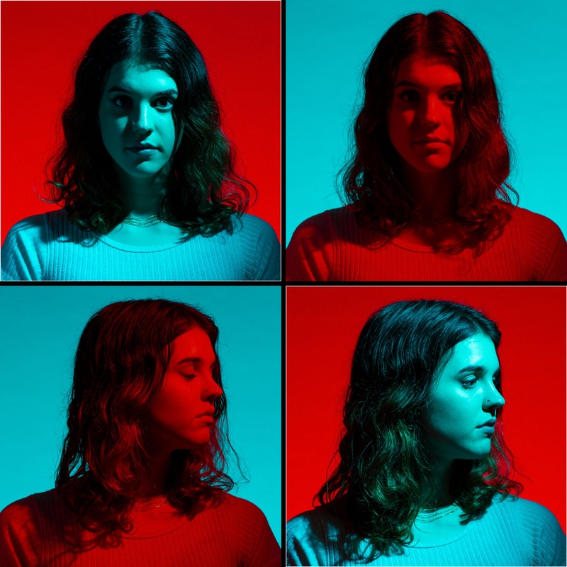
I recently did a conceptual photo shoot with my friend Madeline that was inspired by mid-century pop art and materialism. Using vivid colors, isolated subject matter, and a good dose of sarcasm, we created some really fun images that are both shallow and critical at the same time. OMG, that’s me in a nutshell!
After seeing a number of classic Andy Warhol and Roy Lichtenstein works during my research, I wanted the challenge of creating this saturated color look in camera (for the most part). It’s too easy to do a screen-print stylized pop art look in Photoshop, so I went the other route. For many of the photos, I used my trusty flash gels to create subtle and extremely saturated colors that pay homage to this style.
30% OFF! Ends Tonight!
With a white seamless and a good model, you can pretty much sell anything. But should you? America says yes, and that’s kind of what we were playing with here: affluence, abundance, and an undertone of emptiness.
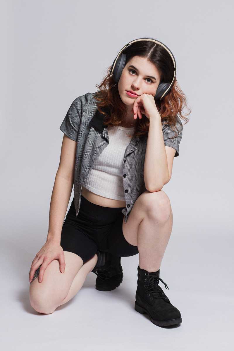
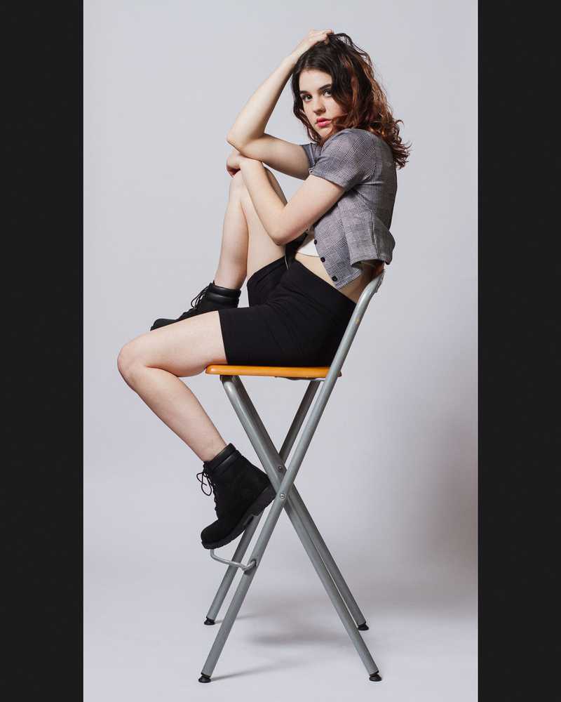
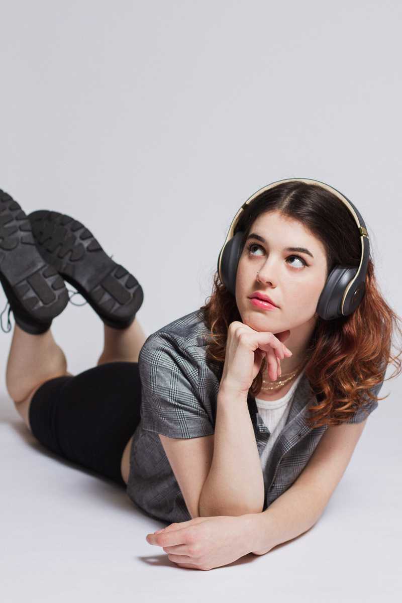
Despite not feeling fulfilled from the latest and greatest products she purchased, Madeline was having a blast with posing. My home studio isn’t very big, but I made sure she had a lot of room to move around and do her thing. I like working with her because she just goes for it. She created so many interesting poses in a very short amount of time. The second one (above) is one of my absolute favorites from the entire shoot. She’s creating multiple triangles with her posing, which perfectly mimics the triangles of the chair.
Overall, I really enjoyed just how liberating it was to shoot on a white seamless. It creates a simplicity that helps move product!
Wow Really?
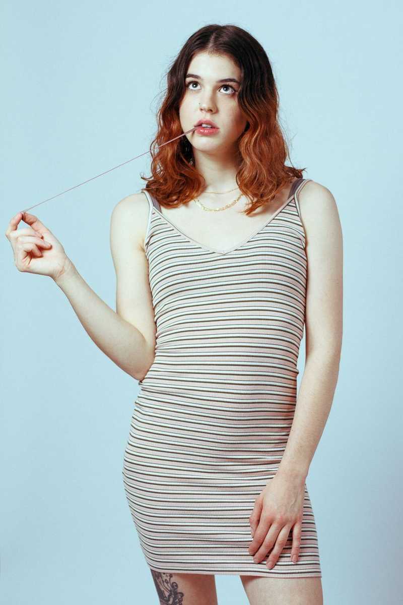
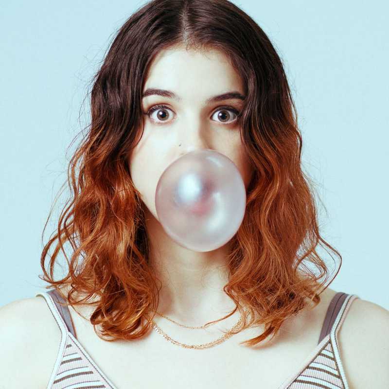
These next photos are heavily inspired by all the Roy Lichtenstein art I was looking at before our collaboration. I feel like it would be fun to add some superficial/funny/subversive thought bubbles to these bubble gum photos. I just might do that.

Is It Soda or Pop?
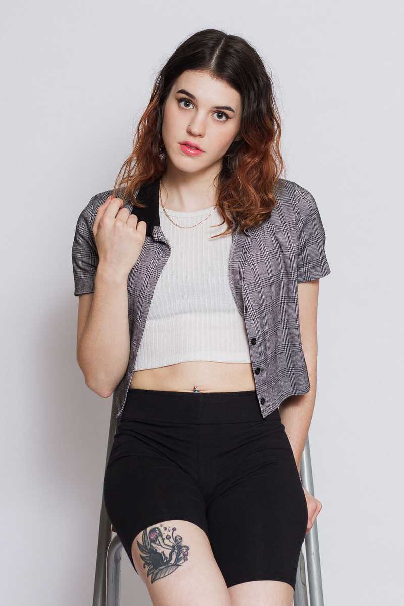
Next, we wanted to create some major brand awareness for a company you may have heard of. After all, sponsorships are the new scholarships. When she sent me a picture of her clothing options for the shoot, it was so refreshing to know she was on the same page as me. Speaking of refreshing! Check out these next photos:
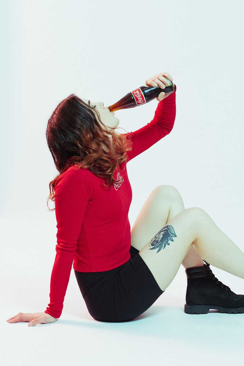
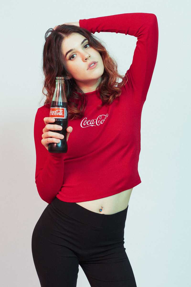
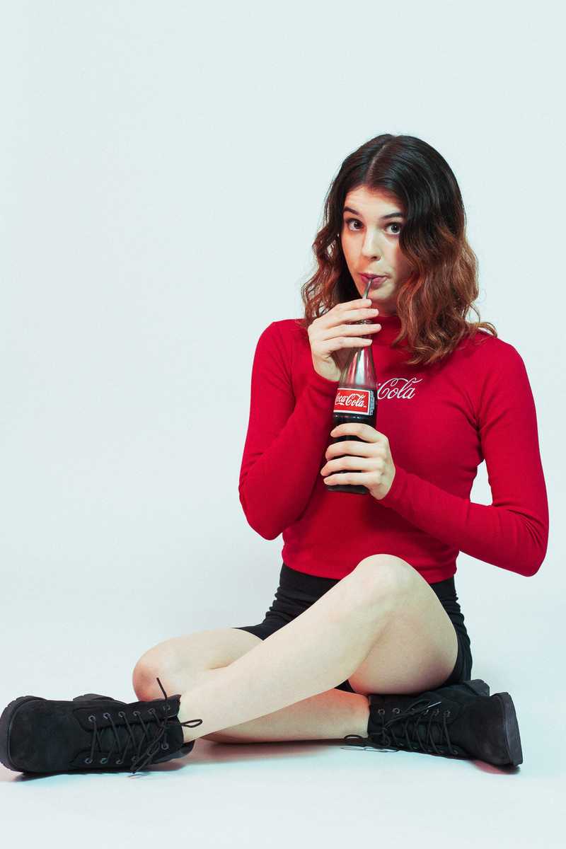
In the above photos, I created a subtle color effect using my flash gels that support the vivid red shirt. The fun stuff happens in the shadows.
Just Say Whoah
For our last look, we stayed with our material/consumption theme, but got moody by replacing the bubble gum and soda with a joint. (According to my legal team, it wasn’t a real joint. That would be a breach of paragraph 4B from our sponsorship contract with Yin Yang Clothing Co.)
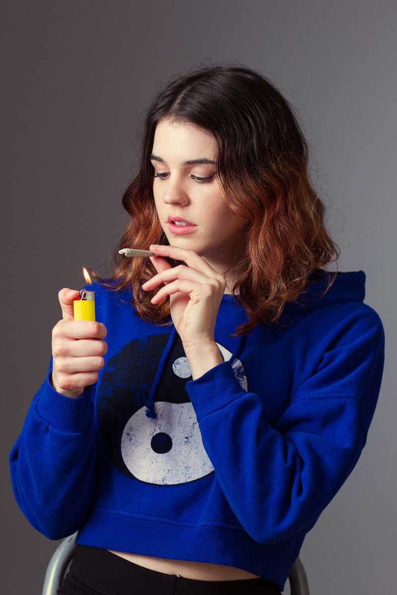
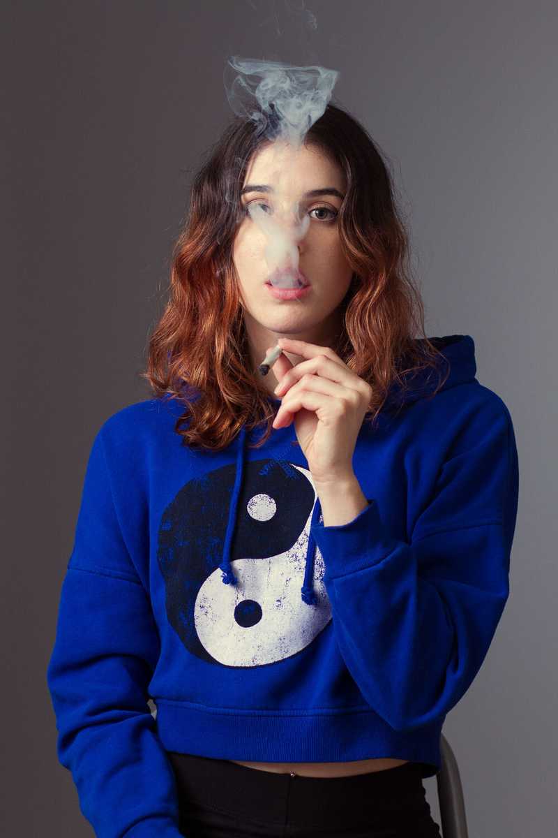
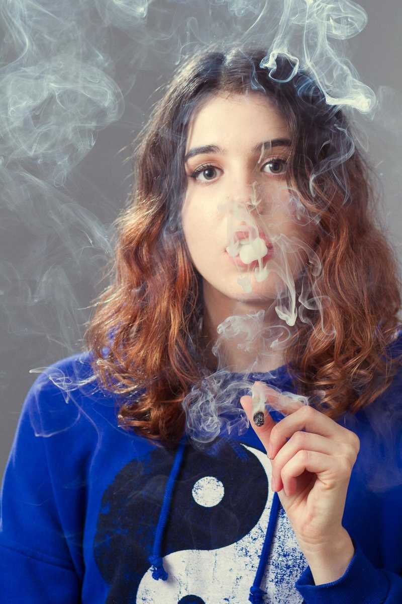
In all seriousness, the photos above have a clean and simple commercial vibe just like the others, but they seem more shocking in a way. While it’s no big deal to see a photo of someone holding a beer or soda, there’s considerably more stigma attached to photos like these, despite weed being completely legal in many states. Should you have a different reaction to a product that has proven medicinal benefits as compared to a product that used to have actual cocaine as an ingredient and was touted as having health benefits? I don’t know, I forgot what we were talking about.
Conclusion
For me, this was a super-fun collaboration that challenged me to think extremely simple in terms of color, subject matter, and composition. It was almost like I was trying to create the simplicity of street signs in a photograph, if that makes sense. Also, it’s great how every time Madeline and I create photos, we try to push ourselves a little bit further. Who knows, maybe we’ll be rollin’ in sponsorship dough in no time!
-Chris